QORE FUSION
The Future of AI Integration.
The Future of AI Integration.
QORE is not just a technology company. It's the core where intelligence, data, and systems fuse into one.
THE VISION
In a world of fragmented systems, QORE comes as the central core — the QORE — that connects everything. The brand needed to feel: Intelligent, Powerful, and Human-Centric.
In a world of fragmented systems, QORE comes as the central core — the QORE — that connects everything. The brand needed to feel: Intelligent, Powerful, and Human-Centric.
THE CONCEPT - THE FUSION CORE
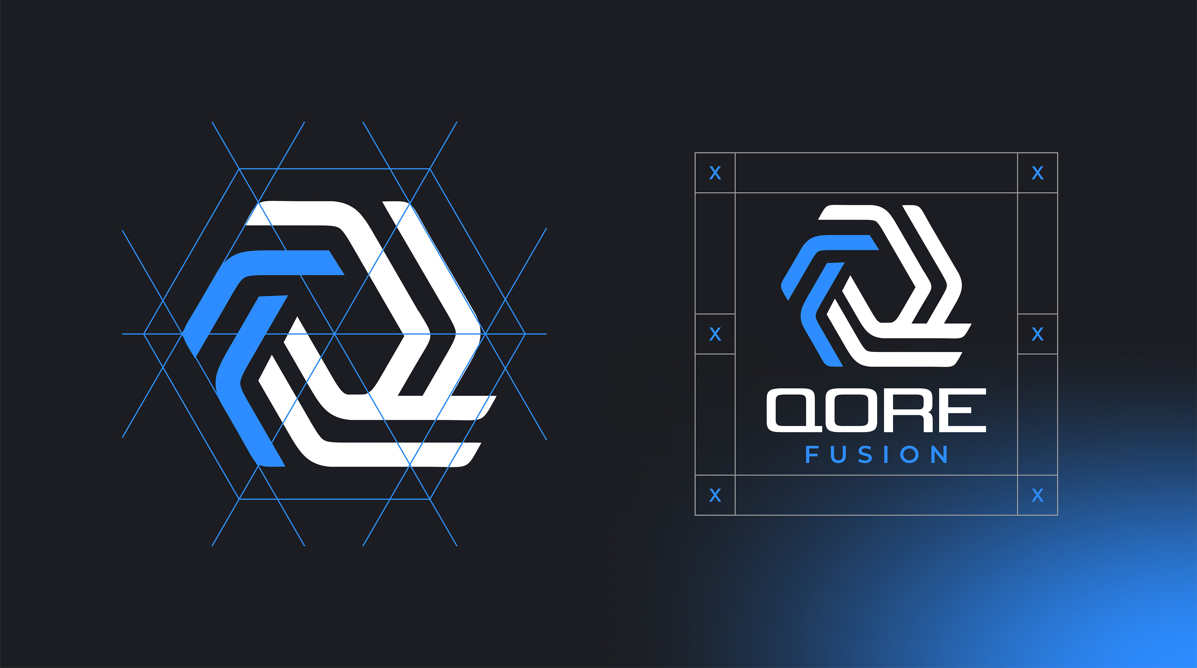
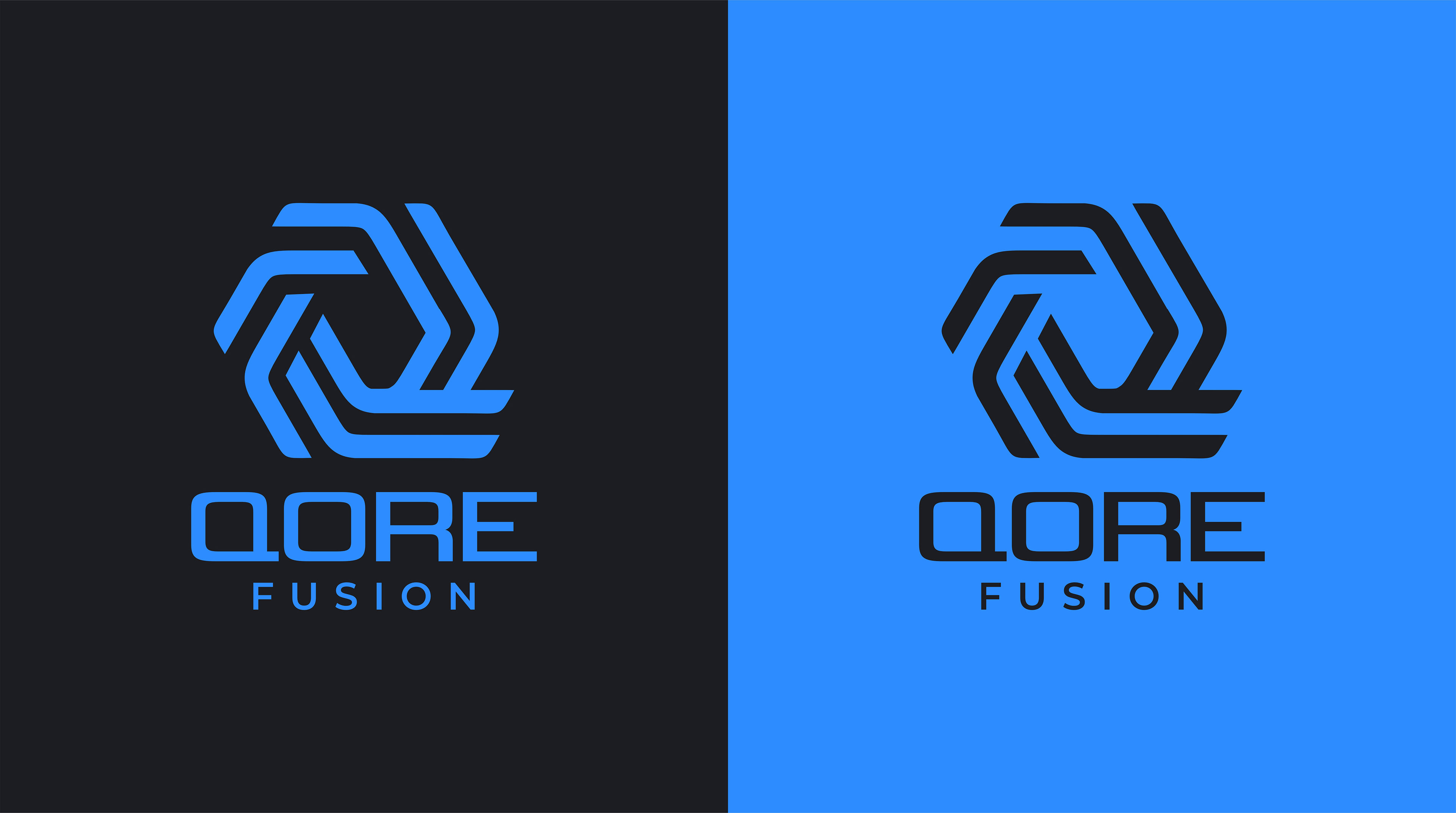
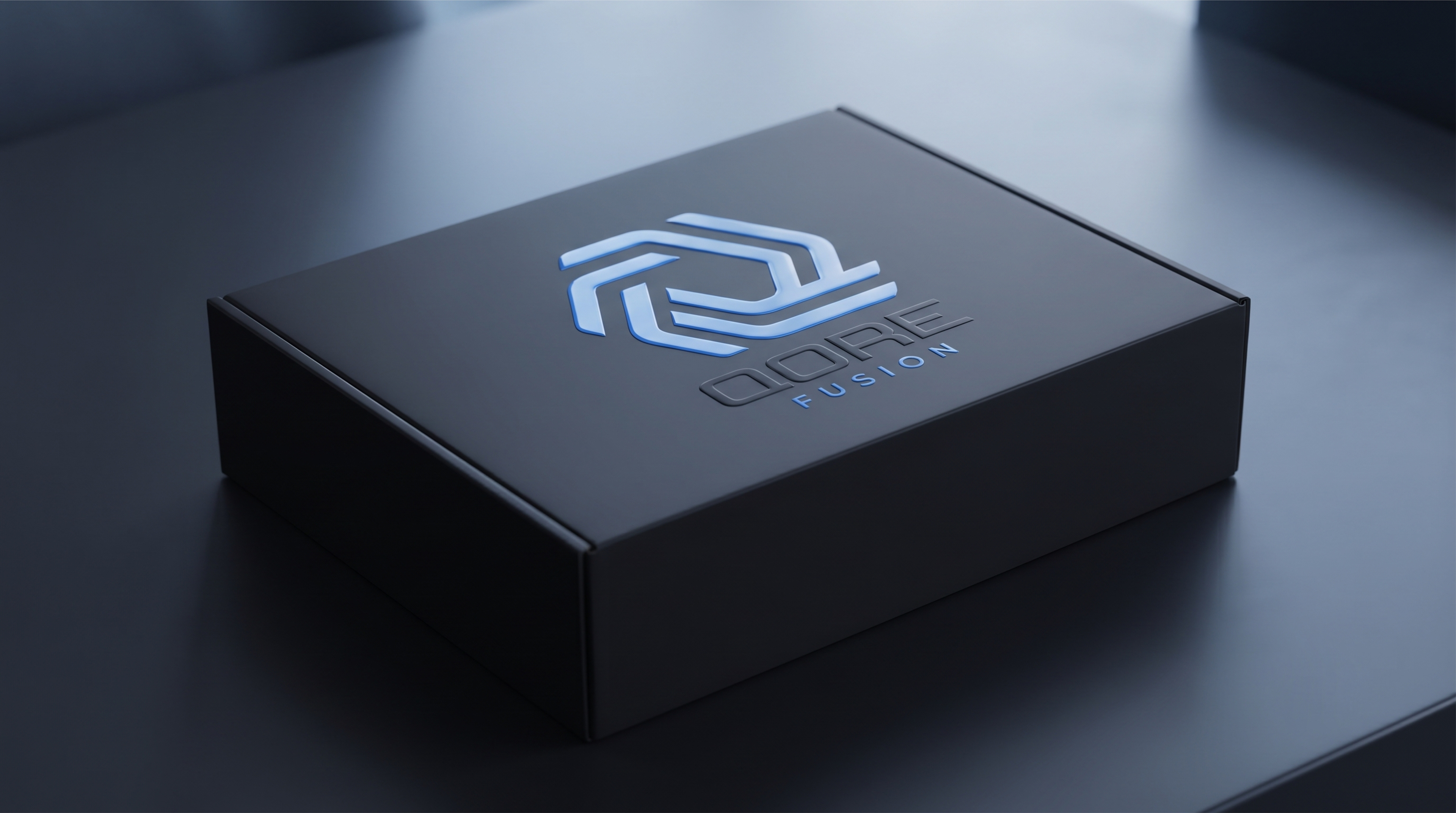
The mark is built from a continuous, interlocking structure forming the letter 'Q'.
The mark is built from a continuous, interlocking structure forming the letter 'Q'.
It represents:
1. THE CORE: A strong, stable hexagon — symbol of structure, security, and data integrity.
2. THE FUSION: Two interlocking forms in a perpetual loop — representing seamless integration, AI learning, and human-machine collaboration.
3. THE FLOW: The electric blue gradient — from Deep Trust Blue to Future Bright — symbolizes data flow, speed, and innovation.
1. THE CORE: A strong, stable hexagon — symbol of structure, security, and data integrity.
2. THE FUSION: Two interlocking forms in a perpetual loop — representing seamless integration, AI learning, and human-machine collaboration.
3. THE FLOW: The electric blue gradient — from Deep Trust Blue to Future Bright — symbolizes data flow, speed, and innovation.
It's a logo that is in constant motion, even when it's static.
THE SYSTEM
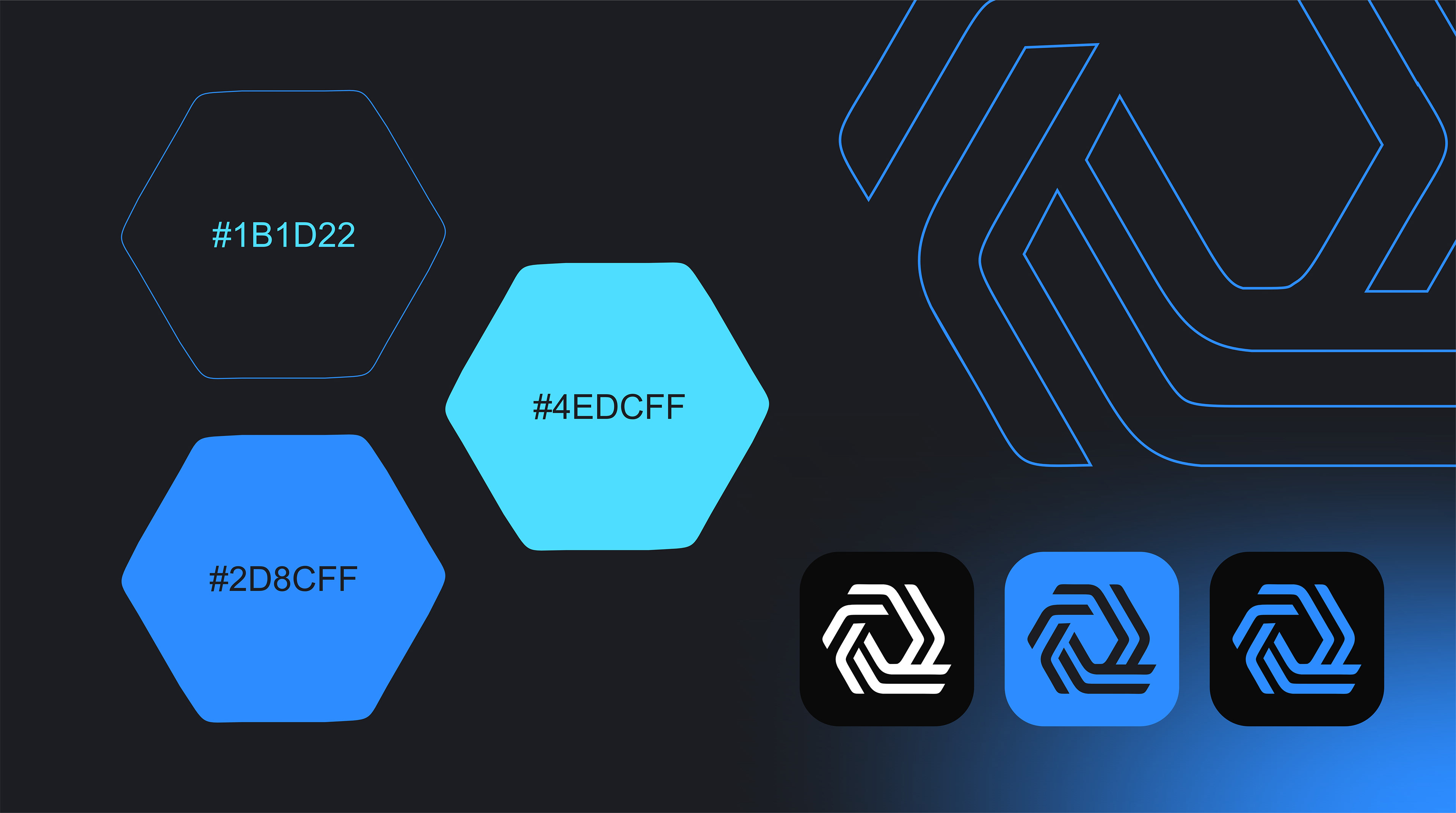
Color: QORE Blue — #0A4FFF to #00D1FF. A gradient that signifies trust, intelligence, and the digital future. Built for dark mode, screens, and immersive environments.
Typography: Geometric, bold, and precise. Engineered for a tech leader.
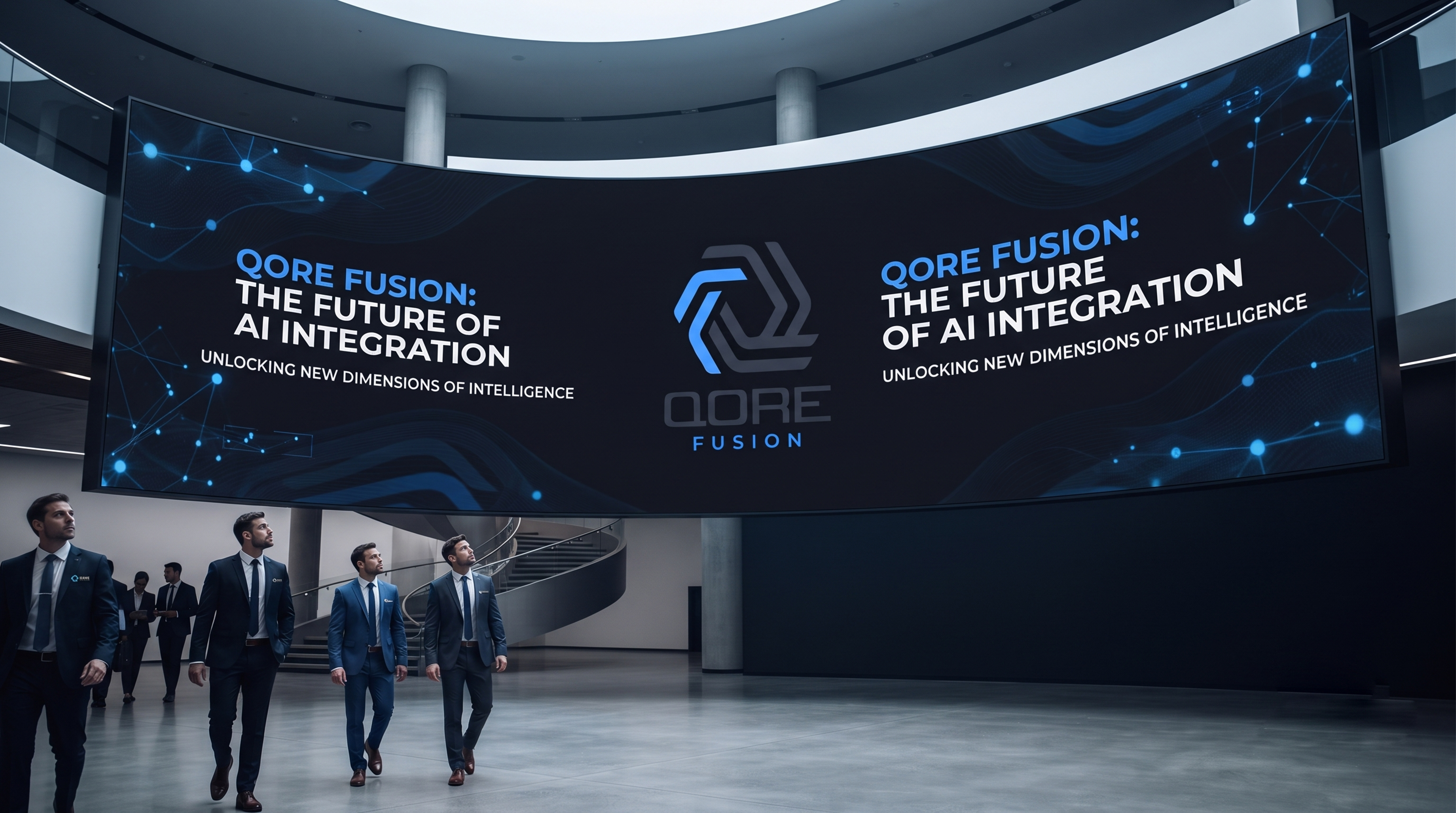
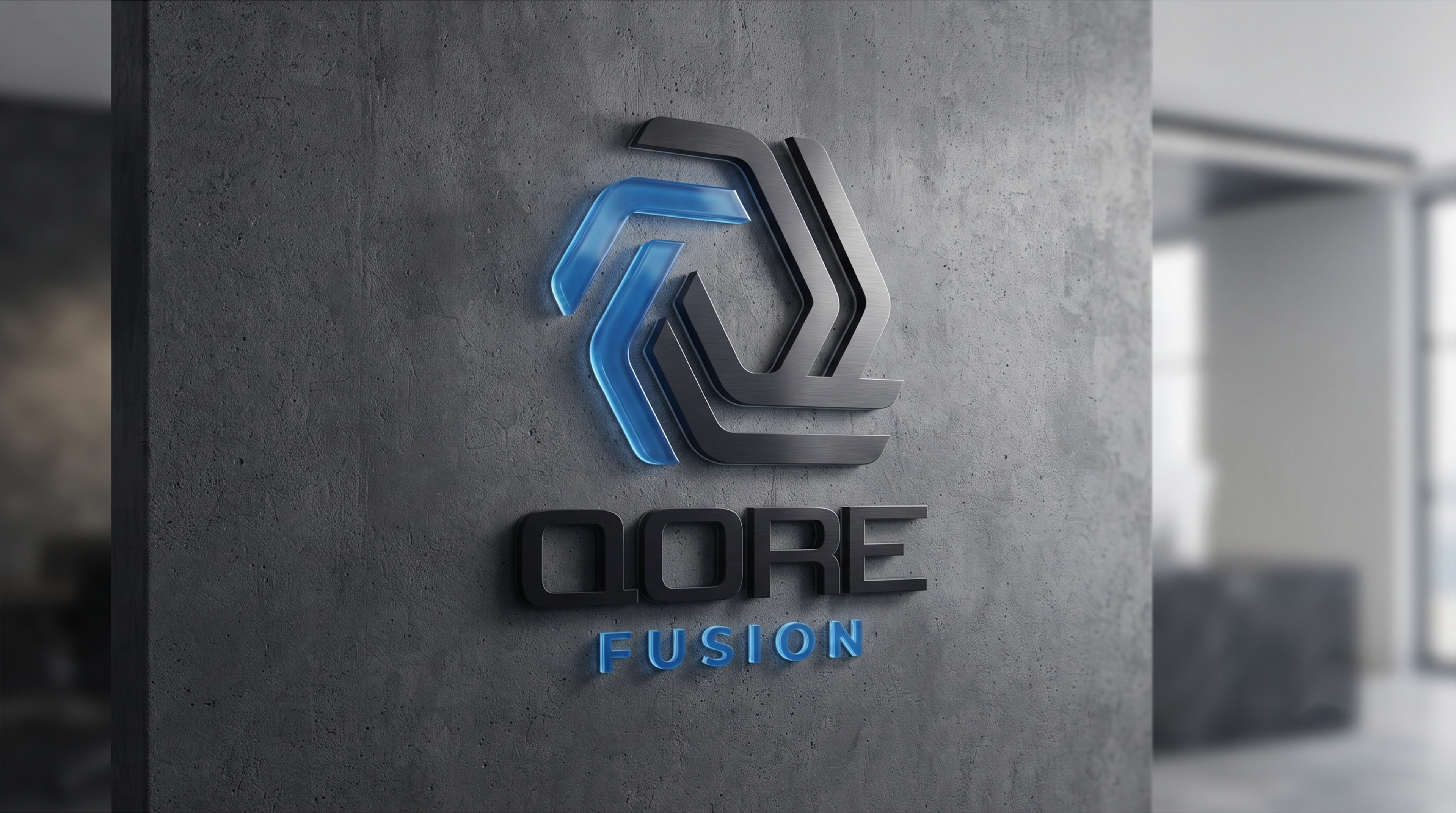
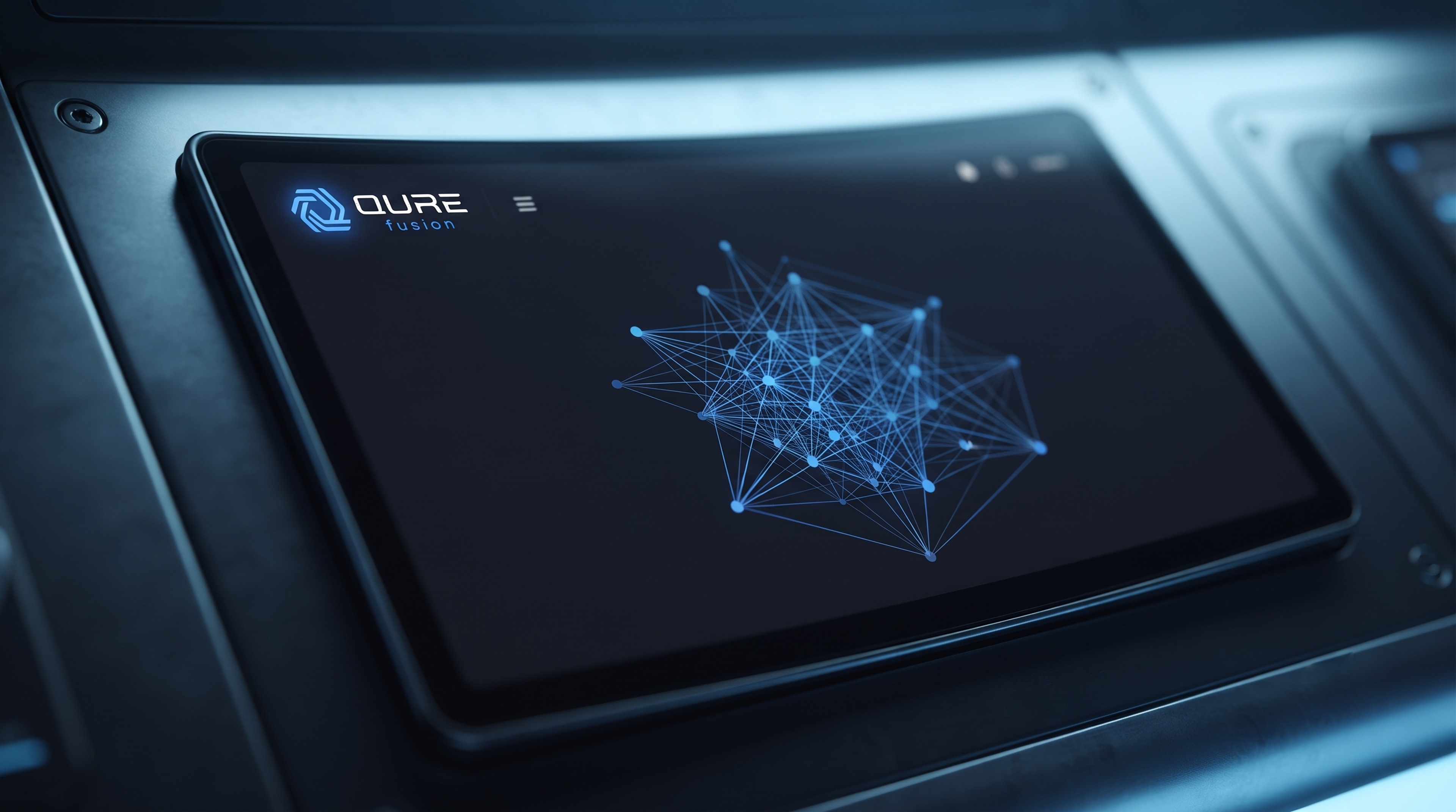
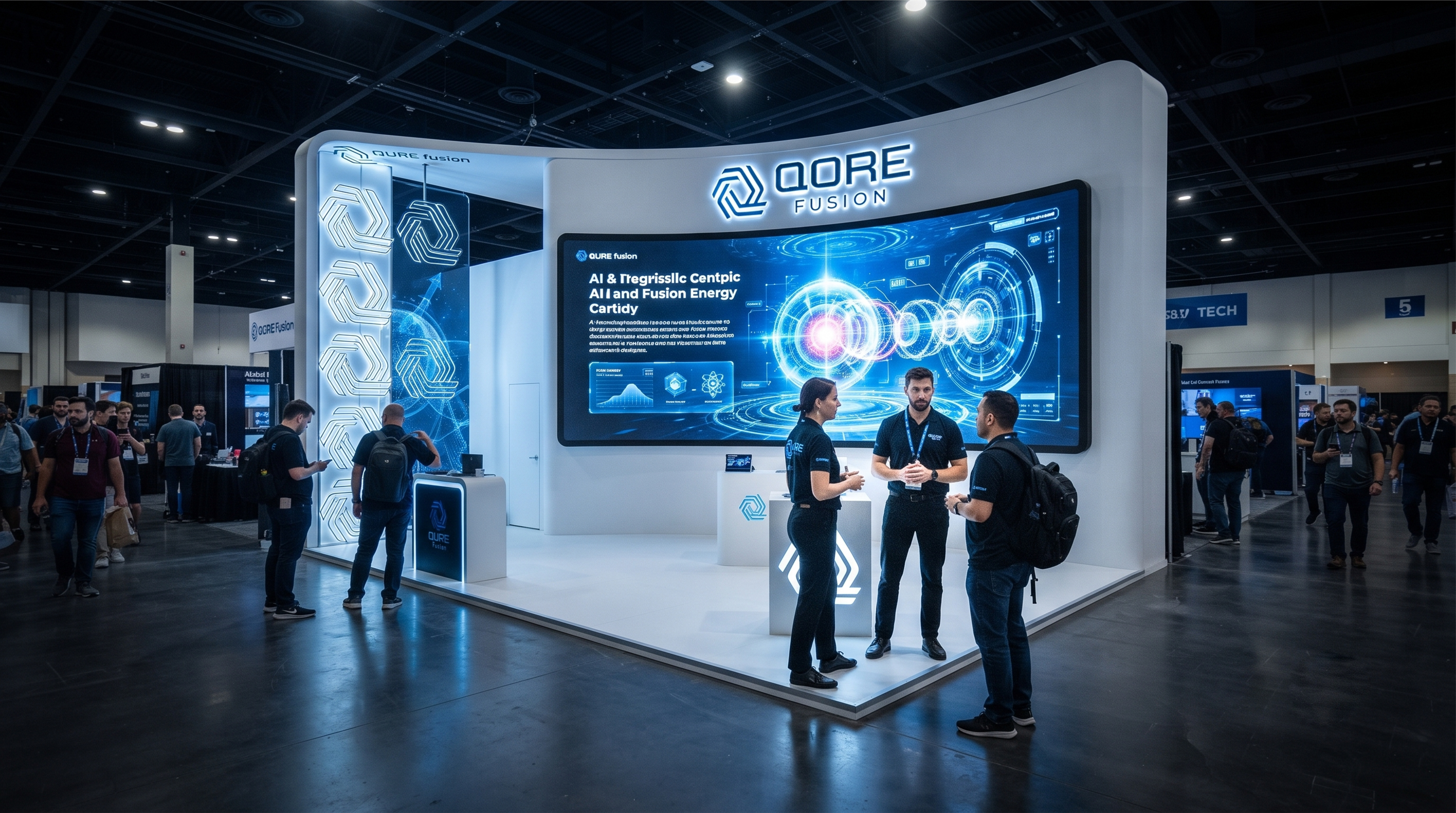
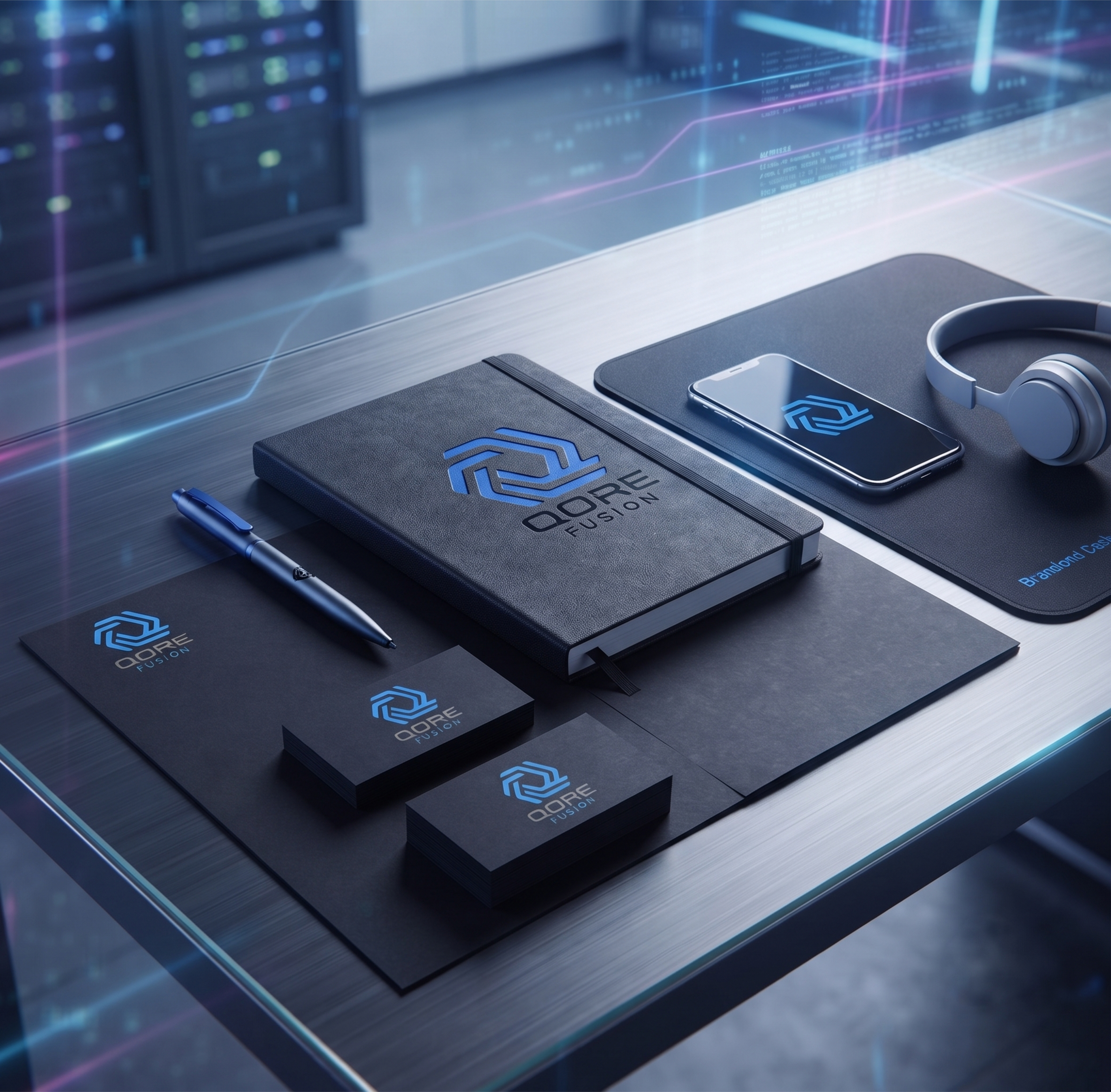
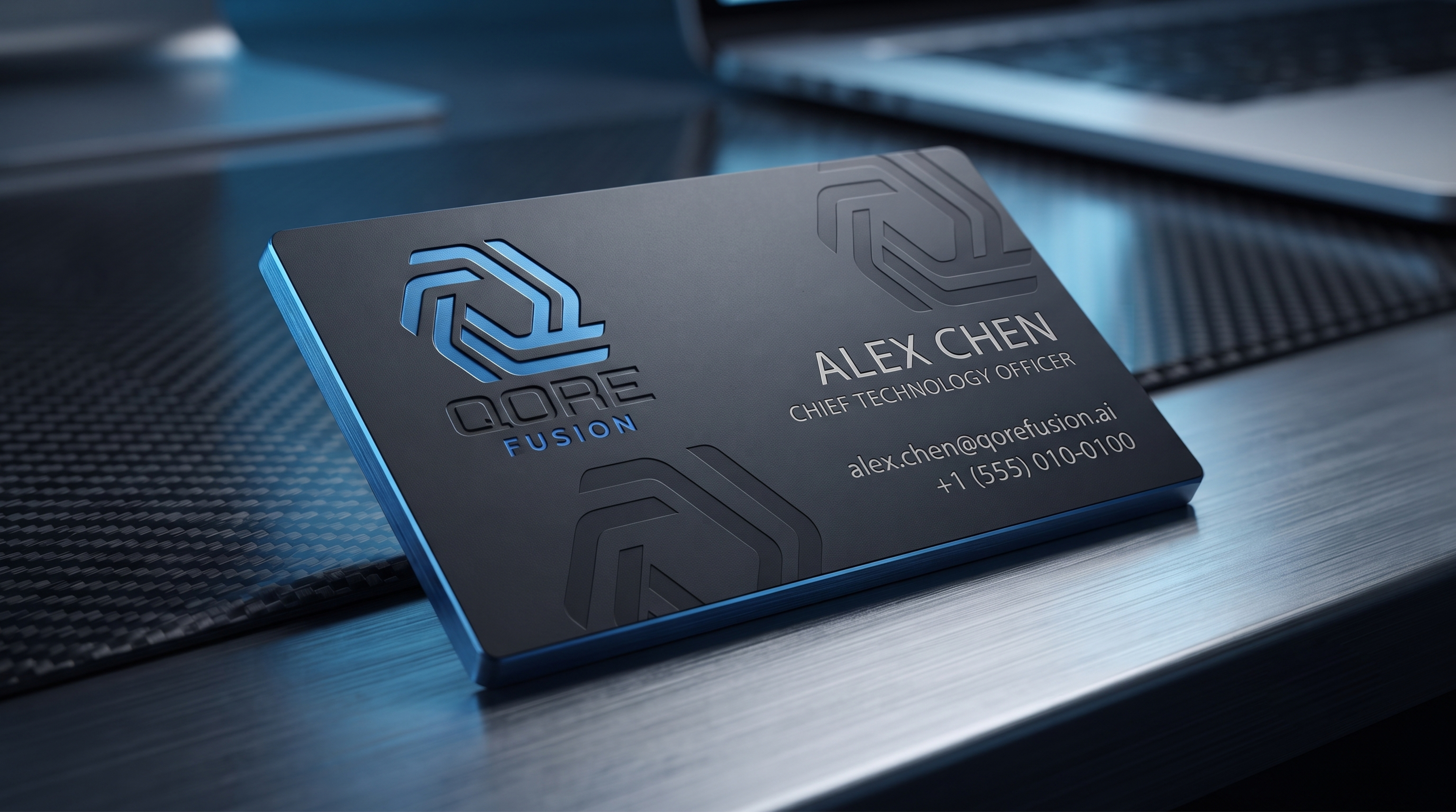
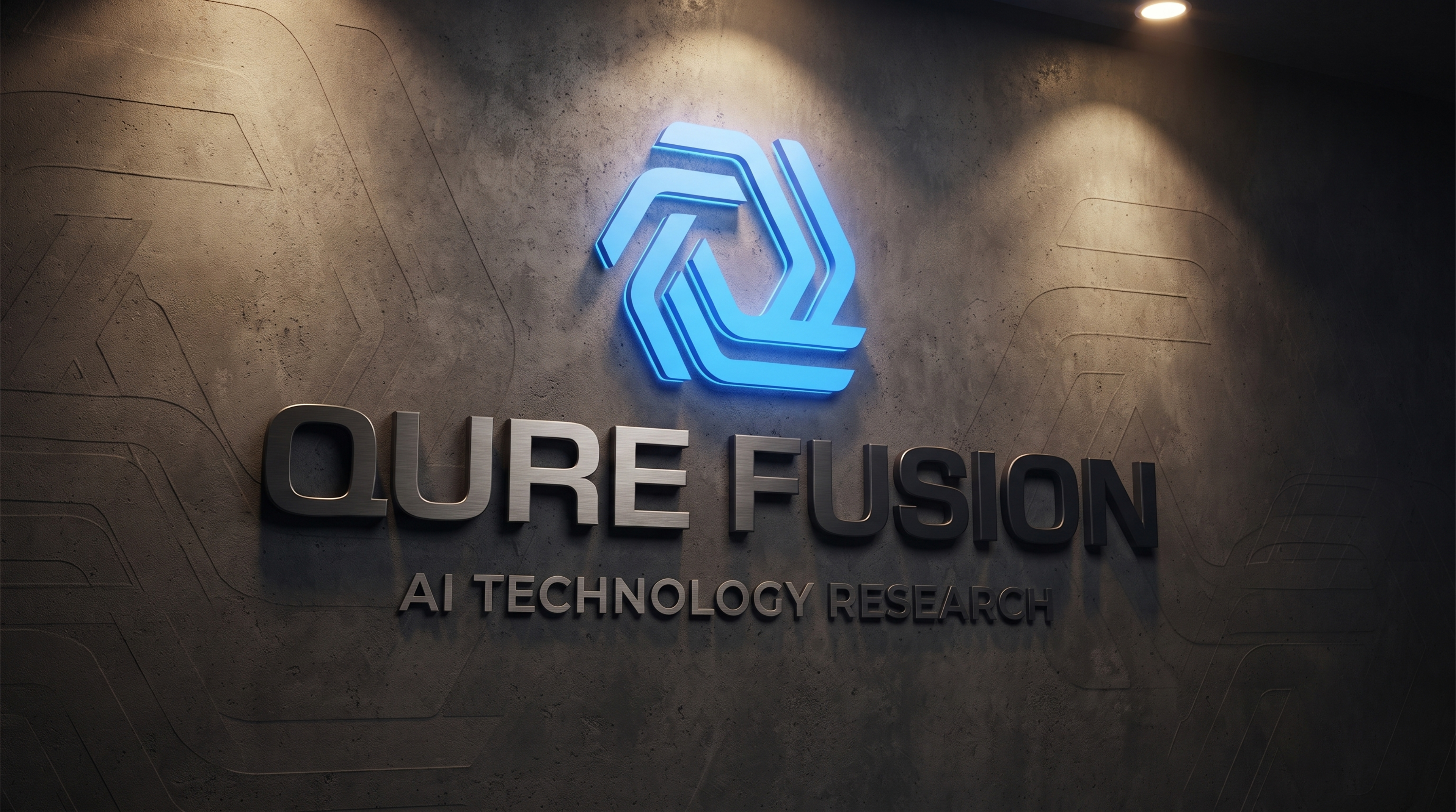
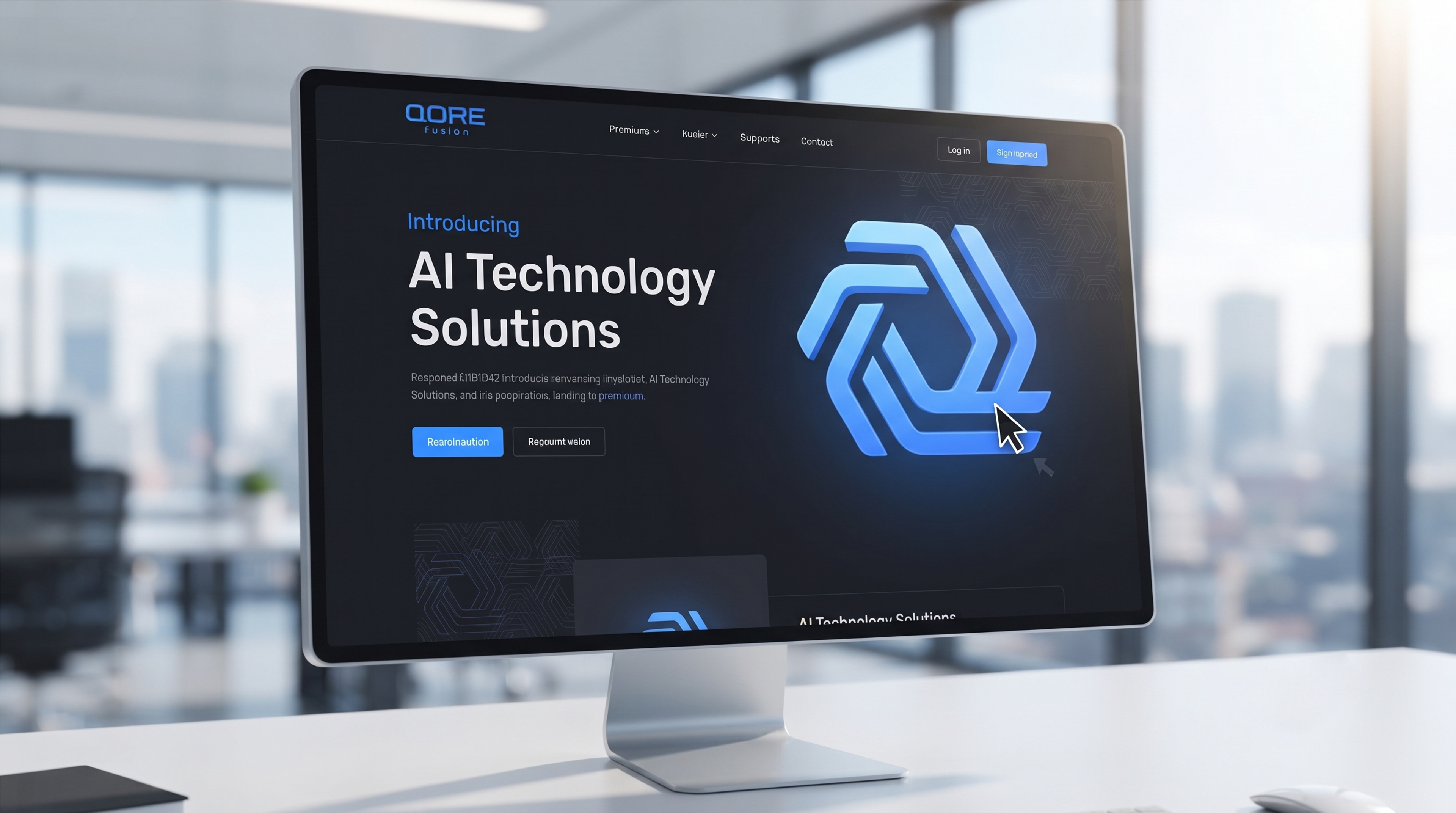
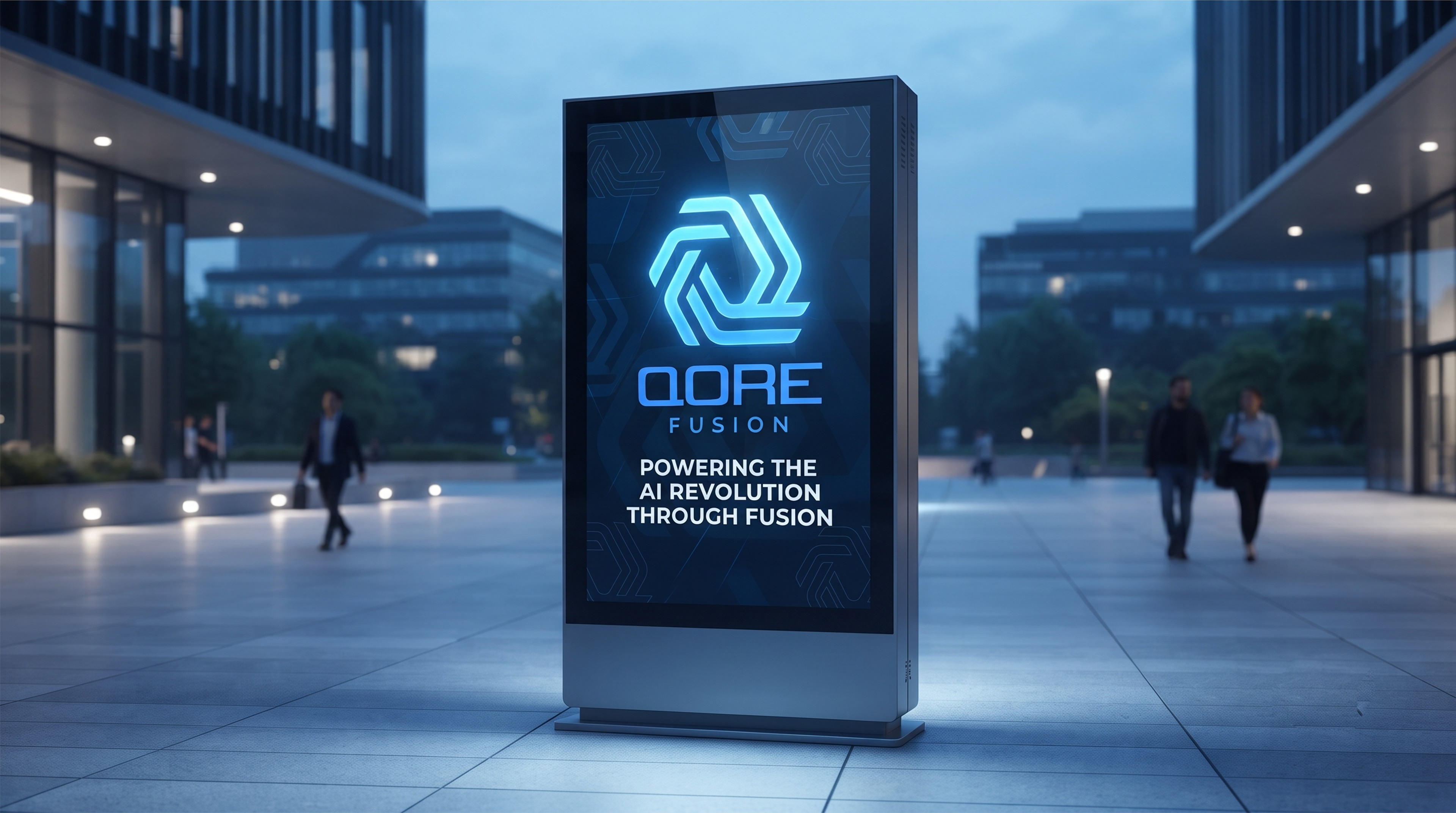
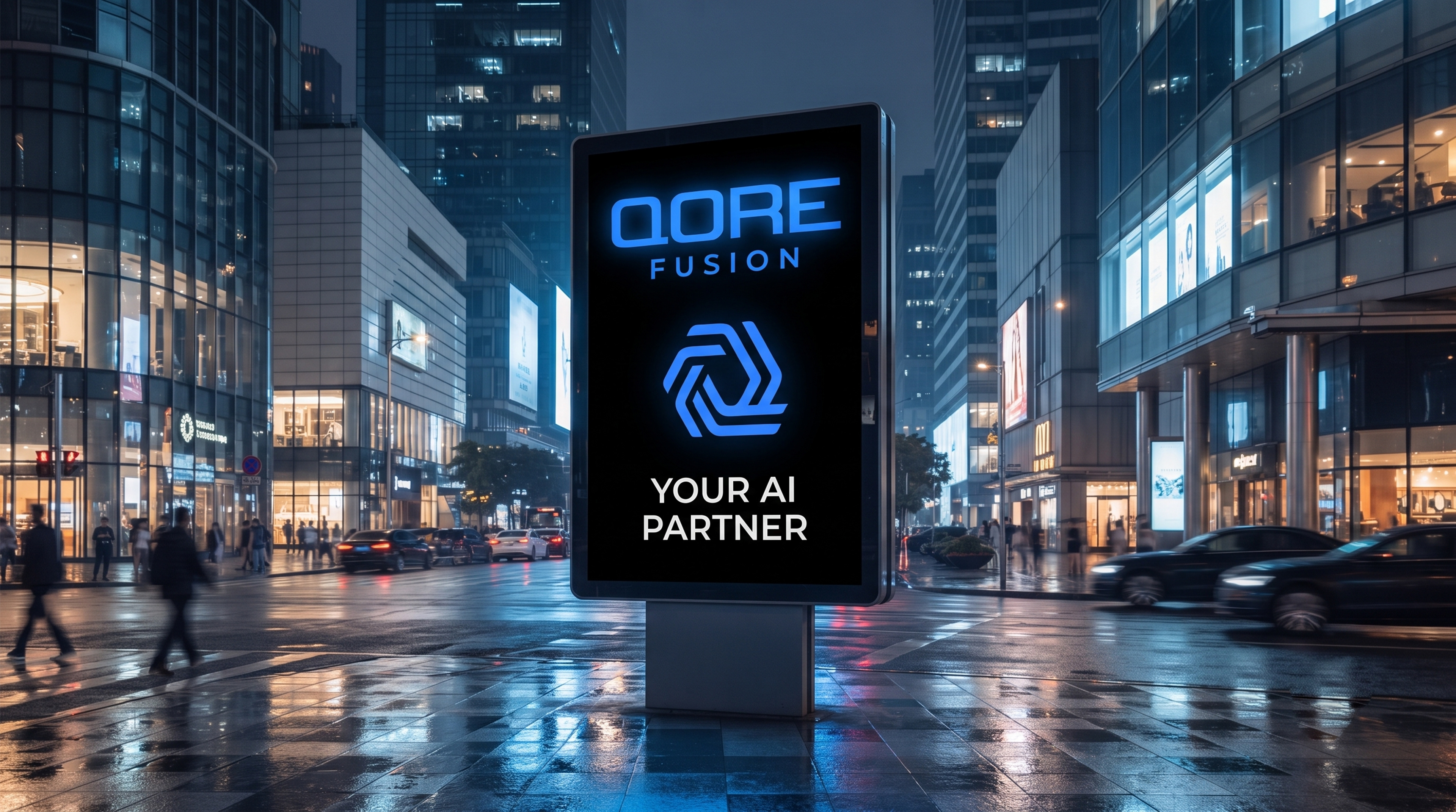
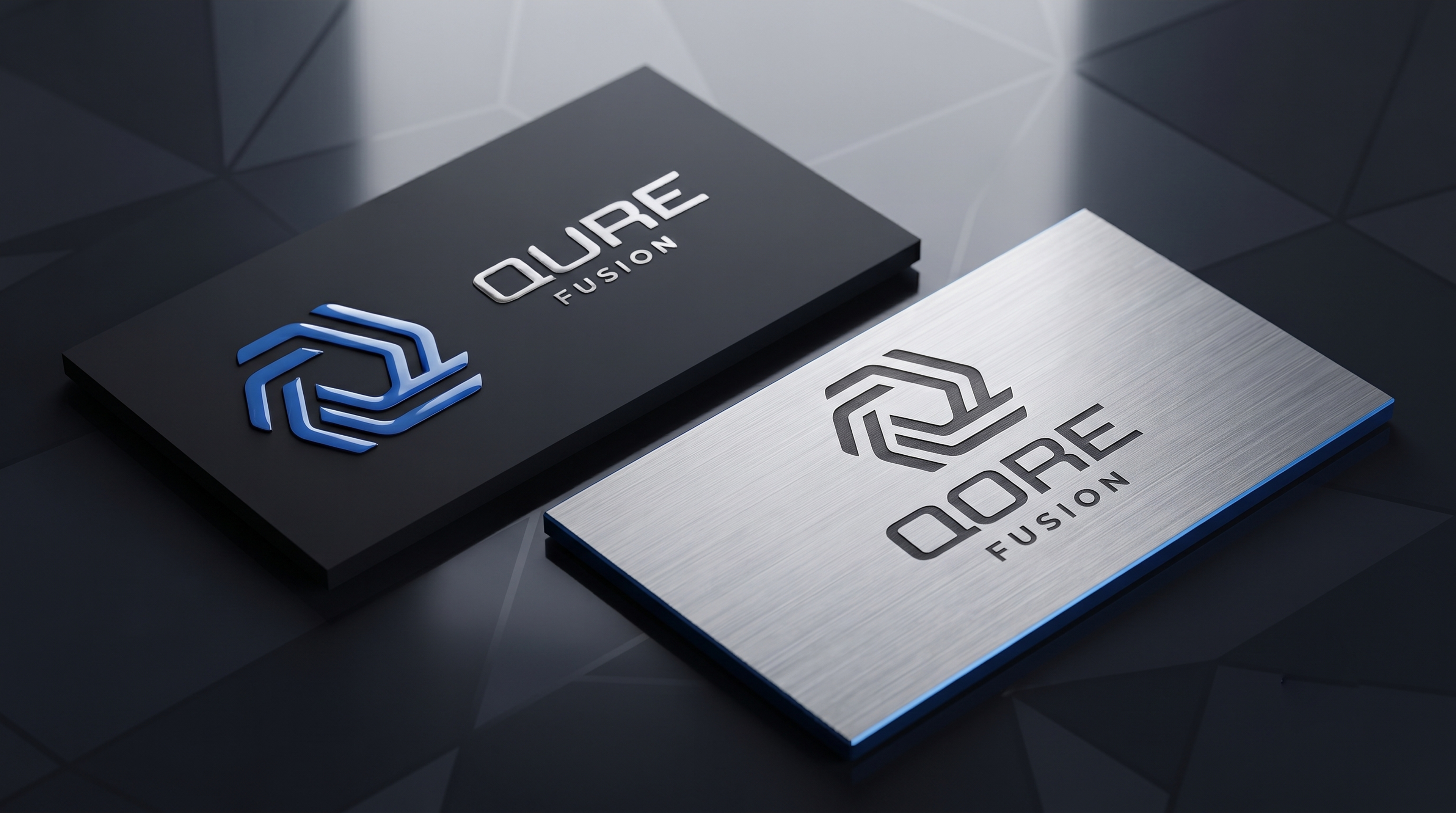
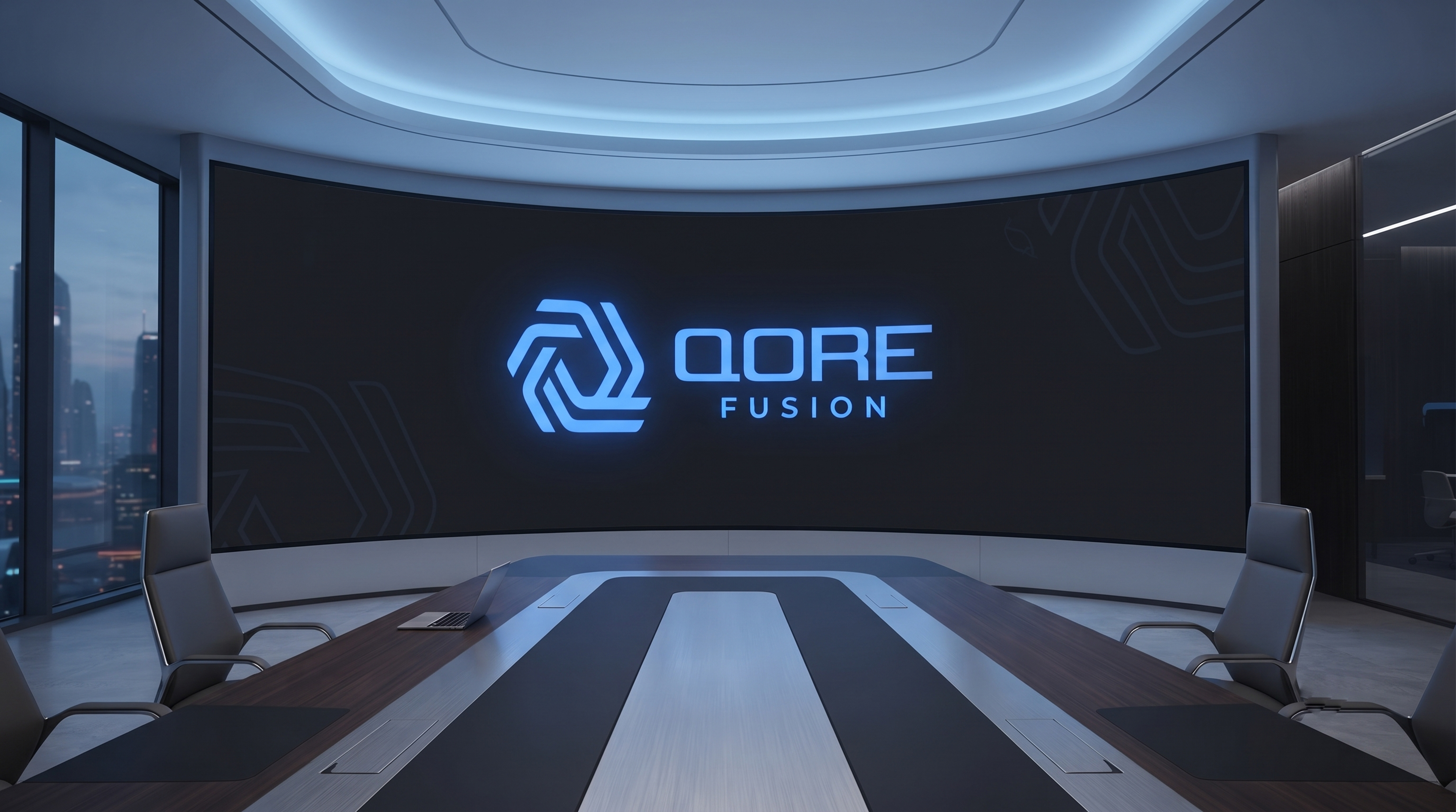
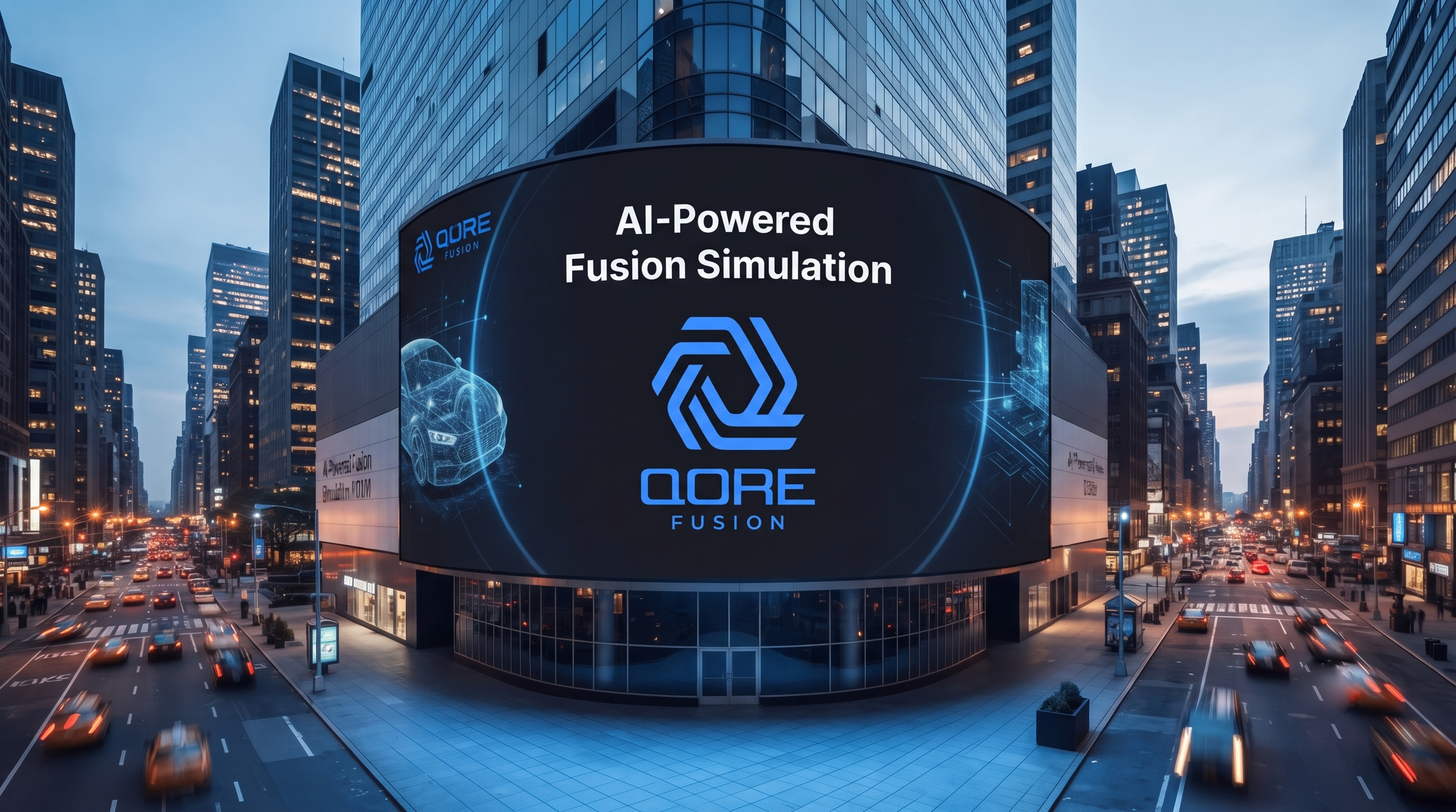
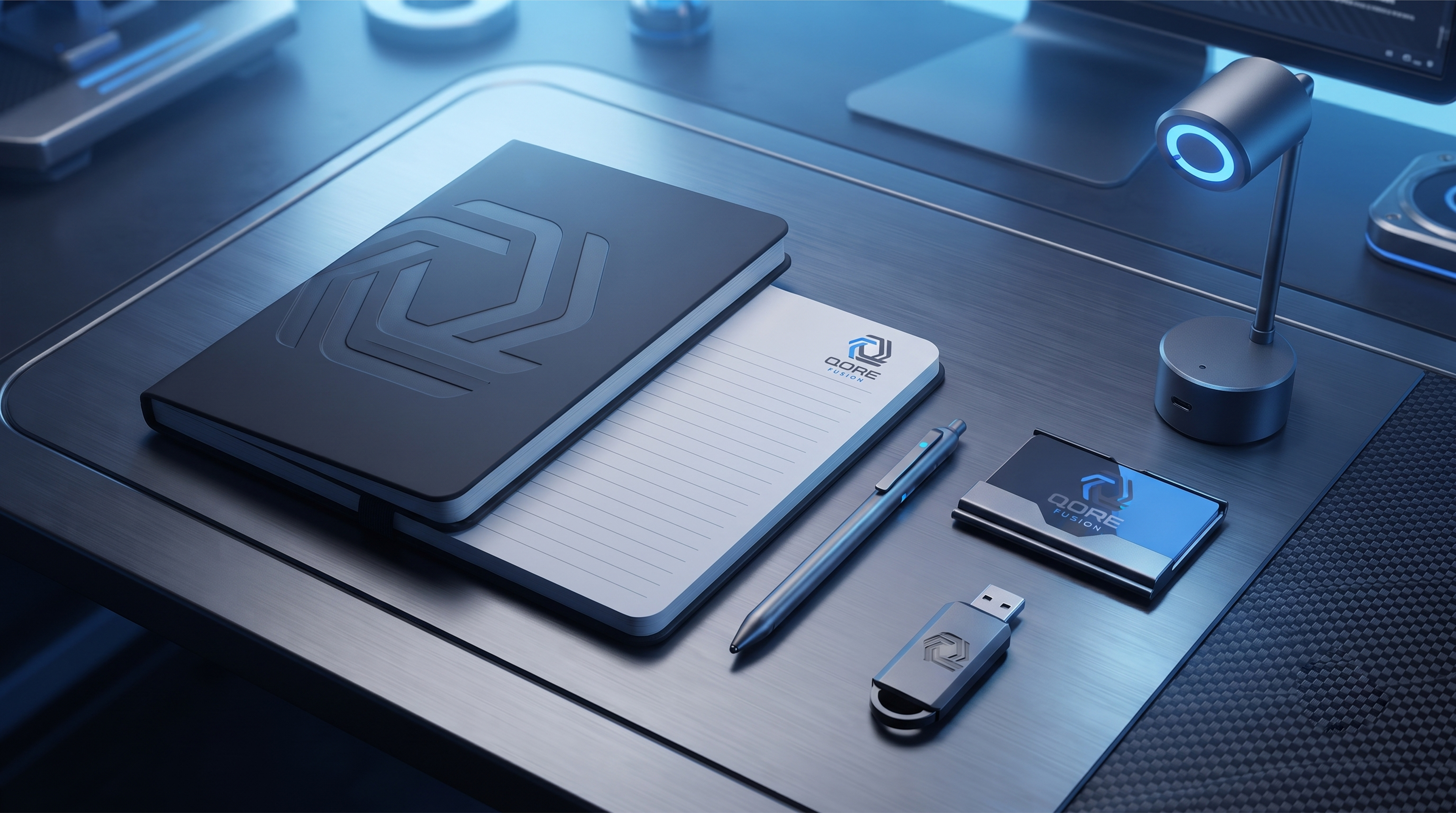
Application: Designed to dominate — from a massive LED stage at a global tech summit, to a concrete embossed wall, to a complex data dashboard in the hands of an engineer.
Color: QORE Blue — #0A4FFF to #00D1FF. A gradient that signifies trust, intelligence, and the digital future. Built for dark mode, screens, and immersive environments.
Typography: Geometric, bold, and precise. Engineered for a tech leader.
Application: Designed to dominate — from a massive LED stage at a global tech summit, to a concrete embossed wall, to a complex data dashboard in the hands of an engineer.
QORE doesn't follow the future. It builds it.
--
Brand Identity | Tech Logo | AI Logo | SaaS Branding | Futuristic Logo
Brand Identity | Tech Logo | AI Logo | SaaS Branding | Futuristic Logo

Thank you for exploring QORE.
This project is a vision of how technology should feel — not cold, but intelligent and connected.
If you felt the future in this brand, an Appreciation would mean a lot.
Designed with precision by Projectdezyn
---
BUILDING THE NEXT BIG TECH BRAND?
BUILDING THE NEXT BIG TECH BRAND?
Your technology is the future. Does your logo look like it?
I help AI, SaaS, and Tech Founders build a premium brand identity that looks as intelligent and powerful as the product behind it.
Inspired by QORE? Let's build your iconic tech brand.
📩 Instagram: @project_dezyn
Available for worldwide projects.
Available for worldwide projects.